Wikipedia:Why mapframe maps?
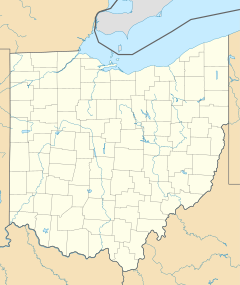
| An average pushpin map | |
|---|---|
| General information | |
| Coordinates | 40°11′15″N 80°59′47″W / 40.18750°N 80.99639°W |
Version with overlaid map
Why are we choosing mapframe maps over older mapping tools? Eight reasons why:
- Automatic mapping is a current internet standard. It's Web 2.0 vs. Web 1.0. Modern websites all across the internet feature interactive maps, from hotel sites to restaurants, bars, travel and tourism websites, historic and preservation organizations, and even newspaper articles. Google Maps has over a billion users per month. People expect an interactive map, and Wikipedia has the capability to add them.
- Automatic mapping is possible and is currently being implemented. All you need to do is put "mapframe = yes" in many infoboxes in order to show a map. No more following a bad tutorial for creating maps. Here is the process to create a pushpin map, the easiest mapping prior to mapframe:
- screenshot an OSM map
- paint it to resemble existing Wikipedia maps
- manually remove every label, park, minor road, and other element, line by line
- upload the image
- create template and description pages in order to use it
- determine the coordinates the map shows, through trial and error on Google Maps or OSM
- finally you can map out sites at this single zoom level
- That's what is needed for pushpin maps. This automatic mapping allows a basic-level editor to add maps to articles, where before they absolutely couldn’t.
- Updating maps is easier. If boundaries or geographical features change, you don't need to re-create the map. OpenStreetMap editors usually will make the change themselves, or you can, and your Wikipedia map will self-update.
- The old mapping process gave us thousands of articles with very poor maps. For instance, nearly every registered historic site in the U.S. has a pushpin map, as of this writing. And only a very small handful of cities have their own pushpin maps, as city pushpin maps are so hard to create and maintain, and there are just too many populated places for anyone to tackle maps for all of them. This means that the best that nearly all these articles can do is show a building's location within a US state. Which really provides no more information than, say, the Akron map already does. Mapframe maps simply don't have this issue; we can provide street-level detail without any additional effort.
- Showing multiple features is easier, and showing shapes is possible. Shapes are impossible for pushpin maps. So you can't show park or city boundaries, you can't show a building's footprint like the Met or the Pentagon.
- Mapframe maps show closer, more intermediate, and larger views than pushpins. For many pushpin maps, you have one to three views. Either in a state, in a city, and/or in a country. Want to see where it is on a continental scale? Sorry! Want to see where it is between streets or in relation to a river, park, or railroad? Sorry! But, interactive maps have 19 zoom levels, so go ahead and show your data at any scale.
- Pushpin maps are limited to showing a dot. For a map of New York, you can't use a dot to accurately represent New York City, just as you can't use a dot on a U.S. map to represent New York or any other state – the scale is off. Likewise a state map showing a building has the inverse problem – a single building is not as large as the pushpin dot represents it to be.
- Titles get in the way of other important information and need to be formatted properly to fit in that tiny square of a pushpin map. Maps with multiple points need crafty formatting to be able to fit all their entries. Not anymore for mapframe maps!
See also
- Wikipedia:Maplink, an informational page about mapframe templates
- Wikipedia:Maps for Wikipedia, a list of mapping tools available on Wikipedia
- Wikipedia:Mapframe maps in infoboxes, a project page tracking implementation status
- Wikipedia:WikiProject Maps/Conventions, standard practices for displaying maps on Wikipedia
- Wikipedia:Using maps and similar sources in Wikipedia articles, a policy essay


