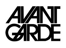
ITC Avant Garde
 | |
| Category | Sans-serif |
|---|---|
| Classification | Geometric |
| Designer(s) |
|
| Foundry | International Typeface Corporation |
| Date released | 1970–1977 |
ITC Avant Garde Gothic is a geometric sans serif font family based on the logo font used in the Avant Garde magazine. Herb Lubalin devised the logo concept and its companion headline typeface, and then he and Tom Carnase, a partner in Lubalin's design firm, worked together to transform the idea into a full-fledged typeface.
The condensed fonts were drawn by Ed Benguiat in 1974, and the obliques were designed by André Gürtler, Erich Gschwind and Christian Mengelt in 1977.
The original designs include one version for setting headlines and one for text copy. However, in the initial digitization, only the text design was chosen, and the ligatures and alternate characters were not included.
The font family consists of five weights (four for condensed), with complementary obliques for widest width fonts.
When ITC released the OpenType version of the font, the original 33 alternate characters and ligatures, plus extra characters were included.
Elsner+Flake also issued the ligatures and alternate characters separately as Avant Garde Gothic Alternate.
Cold Type versions

ITC Avant Garde was never cast into actual foundry type, appearing first only in cold type. Alphatype, Autologic, Berthold, Compugraphic, Dymo, Star/Photon, Harris, Mergenthaler, MGD Graphic Systems, and Varityper all sold the face under the name Avant Garde, while Graphic Systems Inc. offered the face as Suave.[1]
Digital versions
ITC Avant Garde Gothic Pro
It is an OpenType variant of the original ITC Avant Garde Gothic, plus a suite of additional cap and lowercase alternates, new ligatures, unicase glyphs. It supports ISO Adobe 2, Adobe CE, Latin Extended character sets.
In addition, the obliques are altered from the original, where optical corrections are no longer used.[2]
ITC Avant Garde Mono
It is a monospaced version designed by Ned Bunnel in 1983.
Digital version was produced by Elsner+Flake. The family consists of 4 fonts in 2 weights (bold and light) in 1 width, with complementary italics.
William Sans LET
William Sans LET is a very similar font, but the "regular" typeface is known as "Plain 1.0".
Derivatives
ITC Lubalin Graph is a slab-serif version of ITC Avant Garde, also designed by Lubalin.[3]
Similar

- URW Gothic L is a similar font with identical metrics, intended for use as a replacement for ITC Avant Garde in the PostScript Base 35 fonts for the Ghostscript program. The font has since been released under free and open source terms.
- TeX Gyre Adventor is an open-source extension of the above font adding many new characters, and special alternate glyphs.
- Birth of a Hero is a third-party distressed version of Avant Garde created by Segments Design, featuring many of the oblique characters.
See also
References
- ^ Lawson, Alexander, Archie Provan, and Frank Romano, Primer Metal Typeface Identification, National Composition Association, Arlington, Virginia, 1976, pp. 34 - 35.
- ^ Simonson, Mark. "Ain't What ITC Used to Be".
- ^ ITC Lubalin Graph Font Family - by Herb Lubalin, Ed Benguiat[permanent dead link]
