DIN 1451: Difference between revisions
128.100.123.157 (talk) |
Ego White Tray (talk | contribs) Merge in DIN (typeface) |
||
| Line 8: | Line 8: | ||
| foundry = [[Mergenthaler Linotype Company|Linotype GmbH]], [[FSI FontShop International]] |
| foundry = [[Mergenthaler Linotype Company|Linotype GmbH]], [[FSI FontShop International]] |
||
|}} |
|}} |
||
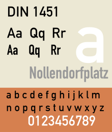
[[Image:DIN 1451.svg|250px|right|thumb|'''[[DIN 1451]]''' typeface adopted by the Deutsches Institut für Normung in 1936.]] |
|||
[[Image:FFDIN.png|250px|right|thumb|'''[[FF DIN]]''' typeface designed by Albert-Jan Pool in 1995, and licensed by [[FontShop|Font Shop International]].]] |
|||
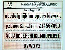
[[Image:DIN1451board.jpg|250px|right|thumb|'''Early DIN-Fette Engschrift specimen.''' Fette Engschrift is a single weight of the DIN 1451 typeface.]] |
|||
'''DIN 1451''' is a [[Sans-serif#Classification|realist]] [[sans-serif]] [[typeface]] that is widely used for traffic, administration and business applications. It has been defined by the [[Germany|German]] standards body ''[[Deutsches Institut für Normung]]'' since 1936. |
'''DIN 1451''' is a [[Sans-serif#Classification|realist]] [[sans-serif]] [[typeface]] that is widely used for traffic, administration and business applications. It has been defined by the [[Germany|German]] standards body ''[[Deutsches Institut für Normung]]'' since 1936. |
||
==History== |
|||
In 1936 the German Standard Committee selected [[DIN 1451]] as the standard typeface for use in the areas of engineering, technology, traffic, administration and business. Among the other recommendations adopted by this committee was an early precursor to the [[Grid (page layout)|typographic grid]]. |
|||
The earliest version of a DIN typeface was released by the D Stempel AG foundry in 1923. Stempel's design was based on a 1905 typeface for the ''Königlich Preußische Eisenbahn-Verwaltung'' (Royal Prussian Railway Administration) and was applied mostly to schematics and blueprints. This version later became the basis for DIN-''Engschrift'' (Condensed). In 1929, the Berthold foundry released a version, and it, too, was used mostly for technical drawings. Both of the early DIN typefaces were made available as lettering templates cut from an acetate material for drafting use. Both of the earliest DIN typefaces were used primarily in oblique form. |
|||
Popularity grew rapidly, once the DIN typeface was adopted. The most widely-used of the DIN-1451 group was DIN-''Mittelschrift'' (Medium). It was released as a metal type, as acetate stencils for smaller applications, as larger metal stencils for application to vehicles and in train yards, and as cast metal lettering for street and building signage. Polish and Cyrillic variants of the face were developed in the 1940s. |
|||
Though [[Bauhaus]] used a DIN-inspired logo in catalogs and in a periodical during the 1930s, DIN did not become popular in print until the 1960s. The transferable-lettering-sheet company, [[Letraset]] made several variants available in the 1970s. By the late 1980s, use of DIN typefaces were appearing in European and North American graphics work. In 1995, Dutch typeface designer [[Albert-Jan Pool]] drew a multi-weight version, eventually licensing it to [[FontShop]] International as [[FF DIN]]. The FF DIN family, unlike DIN 1451, uses simplified-standard weight names. |
|||
==Overview== |
==Overview== |
||
| Line 94: | Line 107: | ||
==References== |
==References== |
||
{{reflist}} |
{{reflist}} |
||
The series of articles "The history of the design of a contemporary typeface" in which Albert-Jan Pool published many of his findings on the history of the typefaces of DIN 1451 is a vault of references on this subject. The series was published in the e-magazine 'Encore', issues 13-15, 17-18. These are direct links to the articles. |
*The series of articles "The history of the design of a contemporary typeface" in which Albert-Jan Pool published many of his findings on the history of the typefaces of DIN 1451 is a vault of references on this subject. The series was published in the e-magazine 'Encore', issues 13-15, 17-18. These are direct links to the articles. |
||
* [http://www.magwerk.com/mag.php?magazine=encore&language=en&issue=13&page=32 Industrial Archeology – DIN, the first German Corporate Typeface? ] |
** [http://www.magwerk.com/mag.php?magazine=encore&language=en&issue=13&page=32 Industrial Archeology – DIN, the first German Corporate Typeface? ] |
||
* [http://www.magwerk.com/mag.php?magazine=encore&language=en&issue=14&page=12 The Constructivist Connection – DIN, Bauhaus and the New Typography ] |
** [http://www.magwerk.com/mag.php?magazine=encore&language=en&issue=14&page=12 The Constructivist Connection – DIN, Bauhaus and the New Typography ] |
||
* [http://www.magwerk.com/mag.php?magazine=encore&language=en&issue=15&page=76 Siemens sets a Standard – DIN 1451 on its way up ] |
** [http://www.magwerk.com/mag.php?magazine=encore&language=en&issue=15&page=76 Siemens sets a Standard – DIN 1451 on its way up ] |
||
* [http://www.magwerk.com/mag.php?magazine=encore&language=en&issue=17&page=10 DIN for All: From the Economic Miracle to Art and Vernacular Typography – FF DIN: New at the Start] |
** [http://www.magwerk.com/mag.php?magazine=encore&language=en&issue=17&page=10 DIN for All: From the Economic Miracle to Art and Vernacular Typography – FF DIN: New at the Start] |
||
* [http://www.magwerk.com/mag.php?magazine=encore&language=en&issue=18&page=14 How German is the DIN typeface? – Fahren, fahren, fahren at the Autobahn] |
** [http://www.magwerk.com/mag.php?magazine=encore&language=en&issue=18&page=14 How German is the DIN typeface? – Fahren, fahren, fahren at the Autobahn] |
||
*Blackwell, Lewis. ''20th Century Type.'' Yale University Press: 2004. ISBN 0-300-10073-6. |
|||
*Fiedl, Frederich, Nicholas Ott and Bernard Stein. ''Typography: An Encyclopedic Survey of Type Design and Techniques Through History.'' Black Dog & Leventhal: 1998. ISBN 1-57912-023-7. |
|||
*Jaspert, W. Pincus, W. Turner Berry and A.F. Johnson. ''The Encyclopædia of Type Faces.'' Blandford Press Lts.: 1953, 1983. ISBN 0-7137-1347-X. |
|||
*Macmillan, Neil. ''An A–Z of Type Designers.'' Yale University Press: 2006. ISBN 0-300-11151-7. |
|||
==Further reading== |
==Further reading== |
||
Revision as of 17:05, 22 February 2012
 | |
| Category | Sans-serif |
|---|---|
| Foundry | Linotype GmbH, FSI FontShop International |


DIN 1451 is a realist sans-serif typeface that is widely used for traffic, administration and business applications. It has been defined by the German standards body Deutsches Institut für Normung since 1936.
History
In 1936 the German Standard Committee selected DIN 1451 as the standard typeface for use in the areas of engineering, technology, traffic, administration and business. Among the other recommendations adopted by this committee was an early precursor to the typographic grid.
The earliest version of a DIN typeface was released by the D Stempel AG foundry in 1923. Stempel's design was based on a 1905 typeface for the Königlich Preußische Eisenbahn-Verwaltung (Royal Prussian Railway Administration) and was applied mostly to schematics and blueprints. This version later became the basis for DIN-Engschrift (Condensed). In 1929, the Berthold foundry released a version, and it, too, was used mostly for technical drawings. Both of the early DIN typefaces were made available as lettering templates cut from an acetate material for drafting use. Both of the earliest DIN typefaces were used primarily in oblique form.
Popularity grew rapidly, once the DIN typeface was adopted. The most widely-used of the DIN-1451 group was DIN-Mittelschrift (Medium). It was released as a metal type, as acetate stencils for smaller applications, as larger metal stencils for application to vehicles and in train yards, and as cast metal lettering for street and building signage. Polish and Cyrillic variants of the face were developed in the 1940s.
Though Bauhaus used a DIN-inspired logo in catalogs and in a periodical during the 1930s, DIN did not become popular in print until the 1960s. The transferable-lettering-sheet company, Letraset made several variants available in the 1970s. By the late 1980s, use of DIN typefaces were appearing in European and North American graphics work. In 1995, Dutch typeface designer Albert-Jan Pool drew a multi-weight version, eventually licensing it to FontShop International as FF DIN. The FF DIN family, unlike DIN 1451, uses simplified-standard weight names.
Overview
The DIN 1451 typeface is very legible and easy to reproduce. Both a medium and a narrow version are defined today; an older broad version is no longer used, but may still be encountered on some very old road signs in Germany. The typeface has gained popularity due to its wide exposure and has been also used by non-governmental organisations and businesses. For graphic design and desktop publishing, FSI FontShop International offers an extended version of this typeface called FF DIN.
The origins of this typeface go back to 1905, when the Königlich Preußische Eisenbahn-Verwaltung (Royal Prussian Railway Administration) standardized the lettering to be used on all its rolling stock in a design instruction known as Musterzeichnung (pattern drawing) IV 44. A number of the glyphs have since been changed, in particular those for "t", "6" and "9".
The article series "The history of the design of a contemporary typeface" provides more information about the origins of the typeface.
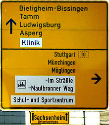
DIN 1451 is a widely used standard typeface for traffic, administration, and business applications. In particular, it is the typeface commonly used on road and railway signage in Germany and a number of other countries. It was also used for many years on German car number plates, until replaced there in November 2000 by FE-Schrift, a font especially designed to make the plates more tamper-proof and to optimize automatic character recognition.
Linotype version
It consists of DIN 1451 MittelSchrift and the condensed DIN 1451 EngSchrift fonts.
OpenType version supports ISO Adobe 2, Adobe CE, Latin Extended character sets. OpenType features include alternates.
DIN 1451 Pro W1G MittelSchrift
It is a version of DIN 1451 MittelSchrift supporting ISO Adobe 2, Adobe CE, Latin Extended, Greek, Cyrillic character sets.
DIN 1451 Cyrillic Mittelschrift (2010)
In April 2010, Linotype announced the release of Cyrillic version of the original DIN 1451 family, in OpenType Std font format.[1]
DIN Next (2009)
It is a variant based on DIN 1451 Engschrift and Mittelschrift, designed by Akira Kobayashi of Linotype, Sandra Winter. Changes include fixing inconsistencies in the old fonts, rounded corners at terminals to emulate the machine cuts of the original fonts, altered terminal angles to reproduce the machine cuts of DIN 1451.
The family includes 21 fonts in 7 weights and 2 widths, with complementary italics for the widest width fonts. It supports ISO-Adobe, Adobe CE, Latin Extended character sets. OpenType features include small caps (lightest 4 weights roman fonts only), old style figures, subscript/superscript, alternates.
Alternates include:
- Uppercase C and G with flat stroke or diagonal endings.
- Serif and sans-serif forms of uppercase I.
- Single-storey lowercase a.
- Lowercase q with an upstroke at the descender end.
- ß ligature composed by long-s and long-z.
- 1 with base serif.
- Rounded 6 and 9.
- Slashed 0.
- 7 and capital Z with horizontal strokes through their diagonals.
DIN Next Rounded (2009)
It is a rounded variant of the font family.
The family includes 4 fonts in 4 weights and 1 width, with no italics. OpenType features include old style figures, subscript/superscript, alternates.
DIN Next W1G (2010)
This version adds support of Greek and Cyrillic characters over DIN Next, designed by Linotype Design Studio.
The family includes 14 fonts in 7 weights and 1 width (widest from DIN Next), with complimentary italics.
Cyrillic version of the fonts were released separately as DIN Next Cyrillic in OpenType Std format.
DIN Next Arabic (2011)
It is a variant designed by Nadine Chahine as a companion to DIN Next. The design is a hybrid of Kufi and Naskh structures suited for titles and short runs of text. The font includes the basic Latin part of DIN Next and support for Arabic, Persian, and Urdu. It also includes proportional and tabular numerals for the supported languages.
The font family includes 7 fonts in 7 weights in 1 width, without italics. OpenType features include fraction, proportional figures, contextual alternates, discretionary ligatures, initial forms, terminal forms, glyph composition/decomposition, isolated forms, medial forms, required ligatures.
Usage examples


Corporate branding
- Logotype and corporate typeface of Sapient corporation
- Logotype of JetBlue Airways
- Logo of the video game Half-Life, with the "A" supplanted by the lower case lambda symbol. Its sequel, "Half-Life 2", uses this font in various places as well, including HUD.
- Logo of the video game "Portal" and its sequel, "Portal 2", with the uppercase "O" replaced with a blue portal.
- Early 2000s on-screen branding of Channel 4 (British television station)
- An adapted version, Habitat DIN, is used by Habitat (retailer)
- Corporate branding of The New West End Company (the Business Improvement District company for London's West End)
- Belgian VRT news service (De Redactie) for logo and news broadcasts.
- Plone logo
- Dutch website DigitaalMedia.nl for logo and the news broadcasts.
- Primary font used in Simon Fraser University documents
- Font for Nine News for their title
- Used on Test The Nation's question graphics
- Primary font used in York Region Transit
- On-air newscasts of most NBC Owned-and-Operated stations (i.e. KNBC, WCAU, WRC-TV, etc.)
- Corporate font used by Birmingham City University
- Opening titles of Dexter (TV series)
- Font for many license plates throughout Europe, including Poland,older German plates, Lithuania, Latvia, Sweden, Romania, and older plates of Albania.
- Used as one of the interface and HUD fonts for the video game Grand Theft Auto IV and its expansion packs.
See also
References
- The series of articles "The history of the design of a contemporary typeface" in which Albert-Jan Pool published many of his findings on the history of the typefaces of DIN 1451 is a vault of references on this subject. The series was published in the e-magazine 'Encore', issues 13-15, 17-18. These are direct links to the articles.
- Industrial Archeology – DIN, the first German Corporate Typeface?
- The Constructivist Connection – DIN, Bauhaus and the New Typography
- Siemens sets a Standard – DIN 1451 on its way up
- DIN for All: From the Economic Miracle to Art and Vernacular Typography – FF DIN: New at the Start
- How German is the DIN typeface? – Fahren, fahren, fahren at the Autobahn
- Blackwell, Lewis. 20th Century Type. Yale University Press: 2004. ISBN 0-300-10073-6.
- Fiedl, Frederich, Nicholas Ott and Bernard Stein. Typography: An Encyclopedic Survey of Type Design and Techniques Through History. Black Dog & Leventhal: 1998. ISBN 1-57912-023-7.
- Jaspert, W. Pincus, W. Turner Berry and A.F. Johnson. The Encyclopædia of Type Faces. Blandford Press Lts.: 1953, 1983. ISBN 0-7137-1347-X.
- Macmillan, Neil. An A–Z of Type Designers. Yale University Press: 2006. ISBN 0-300-11151-7.
Further reading
- DIN 1451-2: Schriften – Serifenlose Linear-Antiqua – Verkehrsschrift. Deutsches Institut für Normung, 1986-02.
- Made with FontFont: FF DIN – The history of a contemporary typeface, article by Albert-Jan Pool in collaboration with Jan Middendorp, BIS Publishers, 2006.
This is an updated version of the series of articles in Encore Magazine that were published in 2004–2005.
External links
- Download of public domain fonts used on roadsigns
- A free implementation of Fette Engschrift, an early version of the DIN 1451 typeface
- A minisite from Fontshop regarding FF DIN, includes history and specs as well as an interview with FF DIN's author.
- Linotype DIN pages: DIN 1451, DIN Next, DIN Next Arabic
