Canadian Landscape
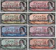
Canadian Landscape is the third series of banknotes of the Canadian dollar issued by the Bank of Canada, first circulated in 1954. The banknotes were designed in 1952 following the accession of Elizabeth II to the throne after the death of her father George VI. The banknote designs differed significantly from the preceding 1937 Series banknotes, though the denomination colours and bilingual printing were retained. This series was followed by the 1969 Scenes of Canada series.
The 1954 Canadian Landscape banknote series became known as the "Devil's Head" series, leading to design modifications for all denominations. The second variant of the series was issued in 1956.[1]
Design
Planning for the banknotes began on 6 February 1952 after the death of George VI and the accession of Elizabeth II to the throne.[2] The first design, created by the Canadian Bank Note Company, was deemed too similar in style to the 1937 Series, including the "elaborate scrollwork" decorating the edges of the banknotes.[3] To reflect a "growing sense of Canadian nationalism", the design of the banknotes was significantly different from that of the 1937 Series, retaining the bilingual text and denomination colours using a modern 1950s style that abandoned Victorian ornamentation associated with Canada's colonial past.[1][2][4] The banknotes were marked with English text to the left of the French text.[1] The less ornate design and arrangement of elements was said to improve the legibility of the banknotes.[5] The banknotes featured the same border style on the obverse and reverse.[6]
All banknotes in the series measure 152.4 by 69.85 millimetres (6.000 by 2.750 in), which are the same length as the 1937 Series banknotes but 1⁄8 inch narrower.[7][8] This change made the banknotes closer in size to the Federal Reserve Notes issued in the United States.[8]
The new notes were introduced by Graham Towers, the Governor of the Bank of Canada, to the Parliamentary Press Gallery in June 1954, and entered circulation that September.[5] In advertisements that ran in Canadian newspapers in September 1954, the Bank of Canada stated that design and use of two colours on the obverse were security features to deter counterfeiting.[4]
Obverse
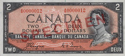
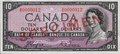
The banknotes all featured a portrait of Elizabeth II, based on a photograph taken by Yousuf Karsh,[8] placed on the right side of the obverse, the first series to carry the portrait of Elizabeth as queen.[8] The photograph was the same one used for the 1952 Canada 2-cent stamp, but was flipped to have Elizabeth II face left, and the diamond tiara she was wearing was removed.[9] The final image was engraved by George Gunderson, master engraver at British American Bank Note Company (BABN, now BA International), after receiving approval from Elizabeth II.[9]
The portrait's placement differed from earlier banknote series that had an oval-framed portrait in the centre of the banknote, which was more susceptible to wearing as it occurred at the crease point for a folded banknote.[5][7] This was the first series to include the Canadian coat of arms, which appeared centrally in the background of the obverse.[1]
- $1 banknote, "Devil's Head" printing
- $2 banknote, "Devil's Head" printing
- $5 banknote, "Devil's Head" printing
- $10 banknote, "Devil's Head" printing
- $20 banknote, "Devil's Head" printing
- $50 banknote, "Devil's Head" printing
- $100 banknote, "Devil's Head" printing
- $1000 banknote, "Devil's Head" printing
Reverse
The design changes were made to portray themes more typical of Canada[10] and lead artist Charles Comfort, contracted by the Bank of Canada to "develop a more contemporary design for Canada's currency", created a rendering of the cenotaph at the National War Memorial with an engraving of pine branches by Eric Bergman, a design he preferred when the reverse of all banknotes in the series were expected to have the same design.[11] He simplified the design and replaced the allegorical themes from earlier banknote issues with scenes of Canadian landscapes, as executives at the Bank of Canada considered the War Memorial "too emotionally loaded".[2][3] The design also included the use of horizontal bands, but the printing companies preferred the more traditional enclosed border.[3]
In 1953, the Bank of Canada announced that the designs of the 1937 Series would be replaced with images of Canadian landscapes.[10][4] The images were chosen from a set of over 3,000 photographs obtained from Archives Canada, Canadian Pacific, and several news agencies.[10][9] The final set of images for consideration were required to satisfy several conditions: preference for rural scenes, no well-known scenes, no large buildings, and little indication of human or economic activity.[9] The Bank of Canada acquired all intellectual property associated with the images, with a transfer of copyright from the owner to the Bank of Canada and the owner required to destroy any outstanding copies or negatives.[9]
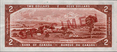
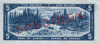
The designs included a Saskatchewan prairie scene engraved for the $1 banknote by Carl Louis Irmscher of the American Bank Note Company, the Saint-François River seen from Upper Melbourne in Richmond, Quebec, engraved by Harry P. Dawson for the $2 banknote,[6] and an engraved scene of Otter Falls on the Aishihik River in southwestern Yukon, at mile 996 of the Alaska Highway, created by C. Gordon Yorke, the first engraving he produced for the Bank of Canada.[12][13] The $10 banknote featured an engraving by Dawson, based on a Canadian Pacific Railway (CPR) photograph by Nicholas Morant of Yoho National Park, of Emerald Lake and Mount Burgess.[12]
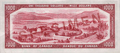
The reverse of the $20 banknote was engraved by Joseph Louis Black of ABN, and William Ford engraved the scene of the Laurentians based on a photograph from the Provincial Publicity Bureau of Quebec.[14] Warrell Alfred Hauk engraved a seascape scene of Crescent Beach in Lockeport, Nova Scotia based on a photograph for the $50 banknote, and Ford engraved a scene of Okanagan Lake for the $100 banknote.[14][15] The original photograph was captured in 1947 by Nicholas Morant.[16] The scene depicted on the $1000 banknote, based on a photograph by Max Sauer, is of a covered bridge spanning the Saguenay River fjord at L'Anse-Saint-Jean in Quebec.[15]
- $1 banknote, "Devil's Head" printing
- $2 banknote, "Devil's Head" printing
- $5 banknote, "Devil's Head" printing
- $10 banknote, "Devil's Head" printing
- $20 banknote, "Devil's Head" printing
- $50 banknote, "Devil's Head" printing
- $100 banknote, "Devil's Head" printing
- $1000 banknote, "Devil's Head" printing
Denominations
| Value | Colour | Obverse | Reverse | Printed | Issued |
|---|---|---|---|---|---|
| $1 | Green | Elizabeth II | Saskatchewan prairie | 1954 | 9 September 1954 |
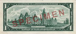
| $1 | Green | Elizabeth II | Original Parliament Buildings | 1967 | 3 January 1967 |
| $2 | Terra cotta | Elizabeth II | A country scene, Richmond, Quebec | 1954 | 9 September 1954 |
| $5 | Blue | Elizabeth II | Otter Falls, (Aishihik River), Yukon | 1954 | 9 September 1954 |
| $10 | Purple | Elizabeth II | Mount Burgess, British Columbia | 1954 | 9 September 1954 |
| $20 | Olive Green | Elizabeth II | Winter landscape, Laurentian Mountains, Quebec | 1954 | 9 September 1954 |
| $50 | Orange | Elizabeth II | Lockeport Beach, Nova Scotia | 1954 | 9 September 1954 |
| $100 | Brown | Elizabeth II | Okanagan Lake, Munson Mountain, British Columbia | 1954 | 9 September 1954 |
| $1000 | Rose Pink | Elizabeth II | L'Anse-Saint-Jean, Quebec | 1954 | 9 September 1954 |
Centennial $1 banknote
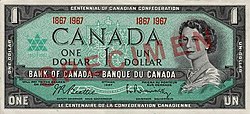
On 3 January 1967, a $1 note commemorating the centennial of Canadian Confederation was introduced into circulation. The image on the reverse of this version shows the original Parliament Buildings, which were destroyed by fire in 1916, and is the same engraving used for a Dominion of Canada banknote designed and printed in the 19th century.[17][18] The obverse includes a green monochrome adaptation of the stylised maple leaf Centennial logo marked with the years 1867 and 1967.[17] The border of the original design was modified to include the text "Le centenaire de la confederation Canadienne" and "Centennial of Canadian Confederation".[18]
Two variants of the design were printed; the first had the serial number at the top of the obverse, whereas the second and more common variant had the years 1867 and 1967 printed twice flanking the apex of the coat of arms.[17] In 1968, the Bank of Canada stopped issuing the commemorative note and once again began circulating the $1 banknote with the Saskatchewan prairie on the reverse.[18]
Printing
The banknotes were printed on dry paper instead of using the wet paper printing process of earlier series,[8] and the paper consisted of 50% flax and 50% cotton.[19] The printing process was changed from earlier banknotes, as the design now required one intaglio plate and two lithographic plates.[19]
The Canadian Bank Note Company printed the $1, $20, $50, $100, and $1000 banknotes, [6][14][15] and the British American Bank Note Company printed the $2, $5, and $10 banknotes,[6][12] and later the $1 banknote as well.[6]
Security
The design of the banknotes featured a "soft vignette" of the portrait on the obverse, instead of the decorative frame about the portrait used for the 1935 Series and 1937 Series of banknotes.[6] This was deemed to make counterfeiting the banknotes more difficult.[6]
By 1967, the series was heavily counterfeited, and by 1973, the $50 banknote had a counterfeit ratio of over 950 parts per million.[20]
Reception and legacy
The banknotes were described as "a little less pro-British" by the Halifax Chronicle-Herald.[8] In 1965, after receiving authorization from the Bank of Canada, the printing companies updated their plates to print 40 banknotes per sheet of paper, instead of 32 printed per page to that point in time.[19] The Bank of Canada also authorized engraving the signatures of the Governor of the Bank of Canada and the deputy governor directly onto the intaglio printing plates, instead of stamping them on the banknotes using letterpress printing.[19]
"Devil's Head" banknotes
The design of the hair behind the ear of Elizabeth II "gave the illusion of a grinning demon", leading to the banknote series nickname "Devil's Head".[1] The demon was described as having "pouchy eyes, hooked nose with flared nostrils and thick loose lips".[21] The devil's head appearance can be seen in the banknote obverses illustrated above, particularly if the right-hand side of the Queen's head is enlarged. British alderman H.L. Hogg of Hartlepool stated that the perfection of the devil's face appearance in the banknote resulted from "the fiendish design of the artist... or the engraver who made the plate" and wrote a letter of complaint to Norman Robertson, the High Commissioner for Canada in the United Kingdom in March 1956.[22] The Bank of Canada had begun addressing the problem in late 1955, and in March 1956, it announced that it had ordered the Canadian Bank Note Company and BA International to modify the engraved printing plates for all banknote denominations, resulting in printed banknotes having darkened highlights of the hair behind the ear.[21][22] Banknotes printed using the new plates were issued later that year.[1] The original banknotes of this series now command high prices amongst numismatics dealers and collectors.[23]
Notes
- ^ a b c d e f Collections Canada.
- ^ a b c The Art and Design of Canadian Bank Notes 2006, p. 49.
- ^ a b c The Art and Design of Canadian Bank Notes 2006, p. 50.
- ^ a b c Bank of Canada, in Quebec Chronicle-Telegraph 1954, p. 17.
- ^ a b c Shawinigan Standard 1954, p. 17.
- ^ a b c d e f g The Art and Design of Canadian Bank Notes 2006, p. 59.
- ^ a b Cross 1997, p. 206.
- ^ a b c d e f Quebec Chronicle-Telegraph 1954, p. 4.
- ^ a b c d e The Art and Design of Canadian Bank Notes 2006, p. 52.
- ^ a b c Montreal Gazette 1953, p. 13.
- ^ The Art and Design of Canadian Bank Notes 2006, p. 51.
- ^ a b c The Art and Design of Canadian Bank Notes 2006, p. 60.
- ^ The Art and Design of Canadian Bank Notes 2006, p. 71.
- ^ a b c The Art and Design of Canadian Bank Notes 2006, p. 61.
- ^ a b c The Art and Design of Canadian Bank Notes 2006, p. 62.
- ^ "Okanagan history. Fifty-second report of the Okanagan Historical Society".
- ^ a b c Bank of Canada.
- ^ a b c The Art and Design of Canadian Bank Notes 2006, p. 63.
- ^ a b c d The Art and Design of Canadian Bank Notes 2006, p. 54.
- ^ Moxley, Meubus & Brown 2007, p. 48.
- ^ a b Toledo Blade 1956, p. 10.
- ^ a b The Art and Design of Canadian Bank Notes 2006, p. 53.
- ^ Ibbotson 2010.
References
- Cross, W.K., ed. (1997). The Charlton Standard Catalogue of Canadian Government Paper Money (10th ed.). Toronto: The Charlton Press. ISBN 0889681902.
- Ibbotson, Heather (22 March 2010). "Paper currency a hot ticket, dealer says". Brantford Expositor. Canoe Sun Media. Archived from the original on 4 September 2015. Retrieved 18 March 2014.
- Moxley, Jill; Meubus, Helen; Brown, Maura (Autumn 2007). "The Canadian Journey: An Odyssey into the Complex World of Bank Note Production" (PDF). Bank of Canada Review. Bank of Canada.
- The Art and Design of Canadian Bank Notes (PDF). Bank of Canada. 6 December 2006. ISBN 0660632462. Retrieved 17 March 2014.
- "Commemorative notes". Bank of Canada. Retrieved 4 March 2014.
- "Canada's new bank notes". Quebec Chronicle-Telegraph. 9 September 1954.
- "1954 Series". Bank Note Series, 1935 to present. Bank of Canada (archived at Collections Canada). Retrieved 4 March 2014.
- "Canadian scenes to be portrayed for banknotes". Montreal Gazette. 22 April 1953.
- "Canada's new bills". Quebec Chronicle-Telegraph. Halifax Chronicle-Herald. 10 September 1954.
- "Canada issues new bank notes". Shawinigan Standard. 2 June 1954.
- "Different hair-do for bank notes". Toledo Blade. Herald Tribune News Service. 27 March 1956.


